TelemetryGrid Charts
Modular Data Visualization Studio & Custom Chart Builder
Live Recording & Interactive Gallery
Project History & Context
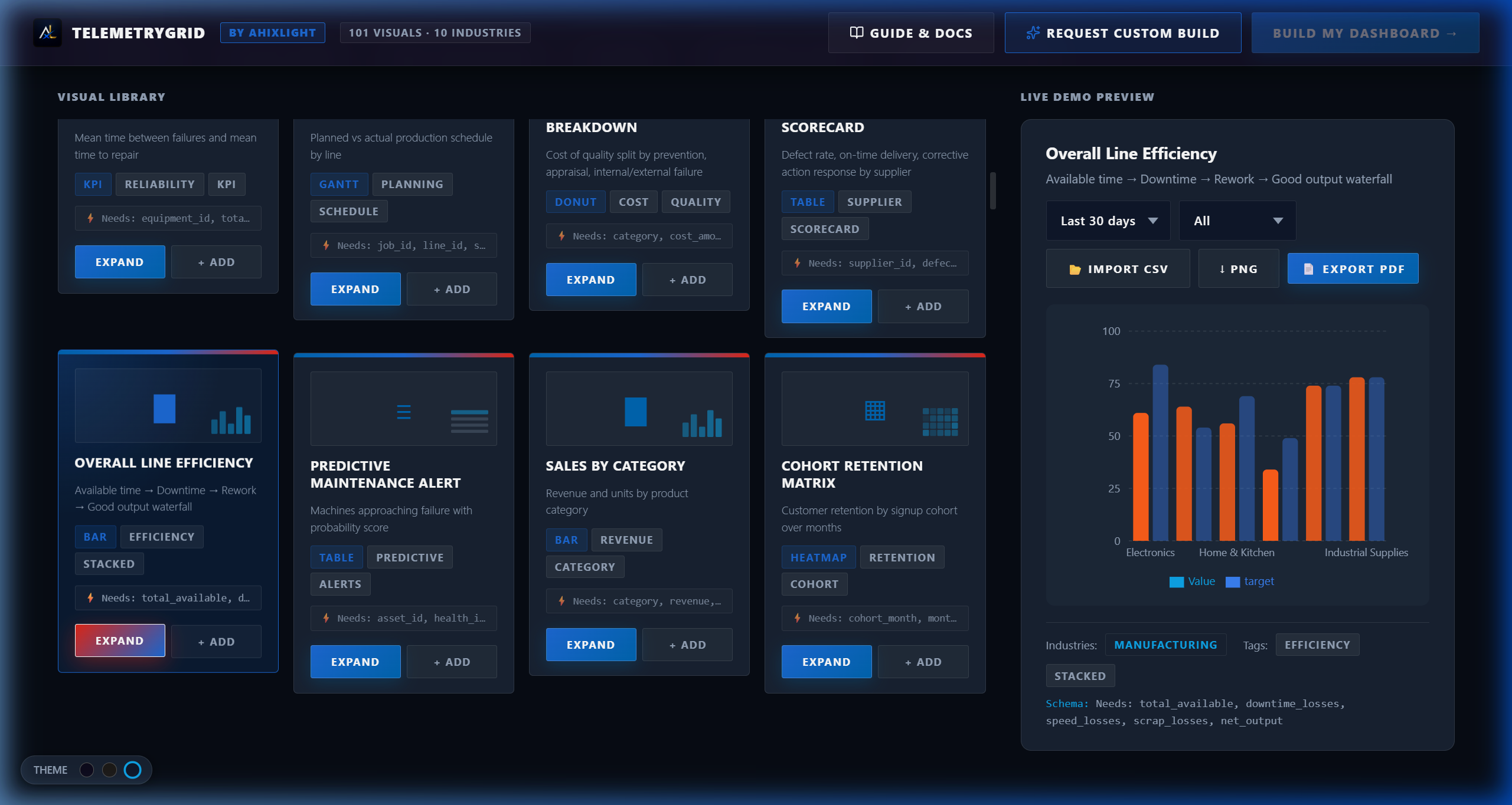
TelemetryGrid was built to solve a clear problem: traditional dashboard tools are either too rigid or too complex to configure. TelemetryGrid provides a modular composer where teams pick required charts, arrange layouts, select visual themes, and watch live data update without SQL dependencies or vendor lock-in.
Core capabilities & interface details

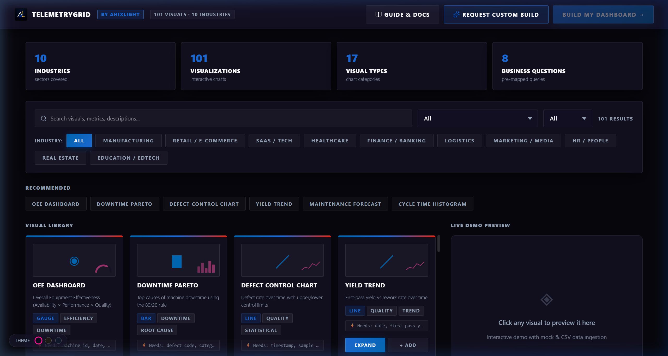
Dashboard Layout Constructor
The main configuration workspace where users build custom analytics dashboards by selecting chart types and arranging them in a responsive grid.
- ▪Side panel selector with chart types: radial gauges, bar charts, area charts, and KPI cards.
- ▪Visual theme switcher altering the entire dashboard style with one click.
- ▪Responsive grid container adjusting layouts between phone, tablet, and monitor viewports.
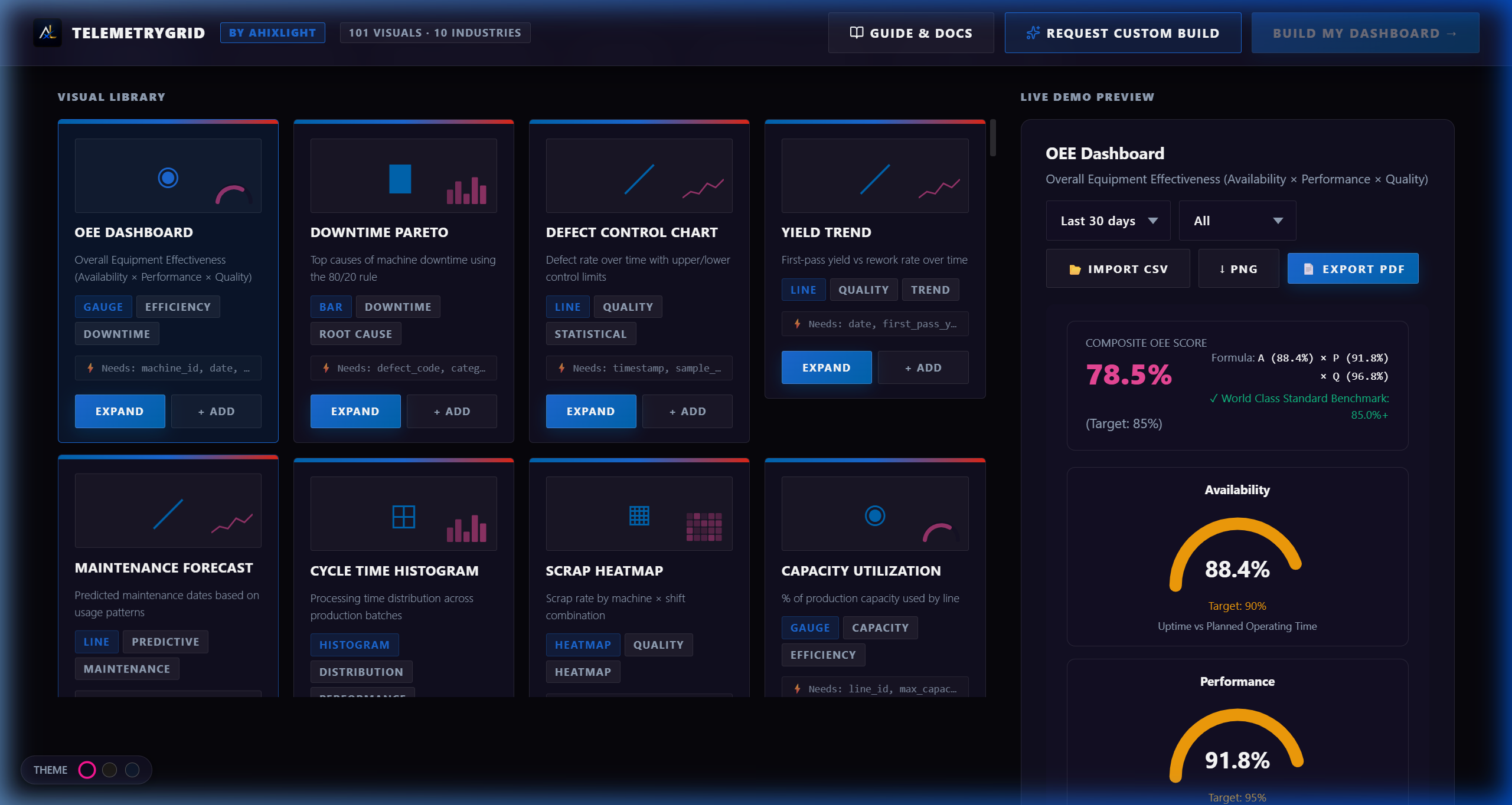
Radial Gauge Efficiency Dashboard
High-precision concentric radial charts displaying performance metrics, availability indicators, and quality ratings.
- ▪Concentric radial charts representing multi-dimension performance indicators.
- ▪Color-coded thresholds to alert users when metrics drop below configured targets.
- ▪Clean visual contrast tailored for dark-themed control and analytics rooms.
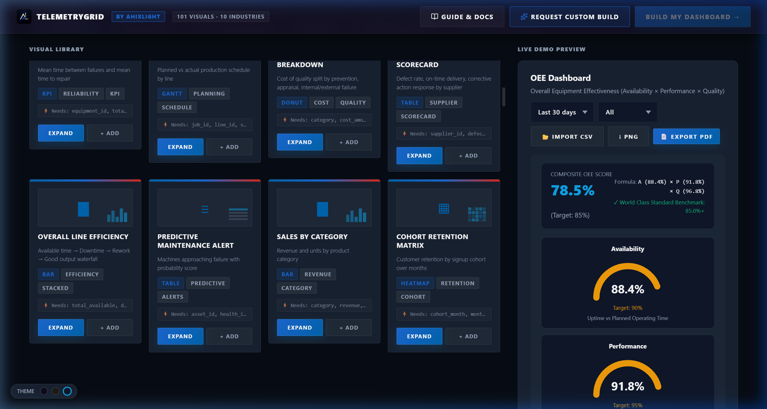
Oceanic Custom Theme Workspace
An alternate visual styling mapping deep teal gradients and slate borders onto telemetry metrics panels.
- ▪Deep teal and slate-gray styling replacing default cobalt variables.
- ▪Optimized background contrast ratios ensuring legibility under glare.
- ▪Clean layout alignment maximizing readable metrics density.
Time-Series & Performance Charting
An advanced visualization panel detailing historical data fluctuations, trend lines, and anomaly markers across any time-series metric.
- ▪High-frequency area charts displaying rate curves and trend movements.
- ▪Interactive markers indicating specific events, anomalies, or threshold breaches.
- ▪Live simulation ticker updates proving interface performance at speed.
The Architectural Problem
Teams across industries need flexible web dashboards that configure quickly and display operational metrics without forcing rigid templates.
The Implemented Solution
TelemetryGrid provides a modular sandbox where users choose their metrics, combine chart types, switch visual themes, and preview live data simulations without writing code.
Functional Specifications
- [01]
On-the-fly custom sub-theme swapping (Oceanic, Dark Sentinel, Neon Grid).
- [02]
Drag-and-drop widget layout with custom KPI and metric configuration.
- [03]
Live data-stream simulation for any time-series or performance metric.
- [04]
One-click export options supporting SVG, PNG, and print-ready PDF reports.
Systems Architecture
Grid System: React Grid Layout responsive wrappers allowing fluid layout adjustments and widget repositioning.
Theme Engine: Scope-wrapped CSS custom property map dynamically switching color palettes and gradient variables.
Chart Layer: ApexCharts wrapper utilizing canvas-optimized renders for smooth live data streaming.
HAVE A SYSTEM TO DESIGN?
We scope and build custom web applications, advanced data visualization systems, and stateful AI dashboards in under 3 weeks.
LET'S DISCUSS YOUR PROJECT