Would I Be Rich?
Lost Opportunity Cost & Inflation-Adjusted Wealth Simulator
Live Recording & Interactive Gallery

Project History & Context
Would I Be Rich? is a consumer fintech simulator designed to gamify long-term saving habits. Typically, people do not associate a daily $5 latte or $15 monthly SaaS subscription with massive terminal wealth loss. The app visualizes this gap by mapping micro-spending logs against historical stock index returns (e.g. S&P 500 average CAGR of 9.8%). It dynamically compounds these numbers, adjusts for historical inflation, and presents the opportunity cost in a clear, interactive visual chart.
Core capabilities & interface details
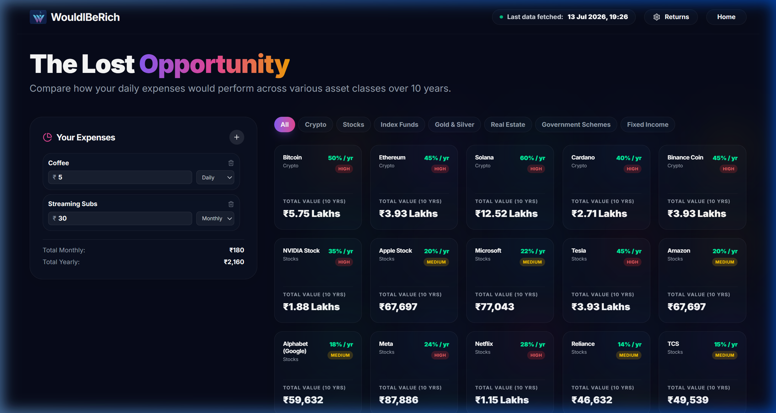
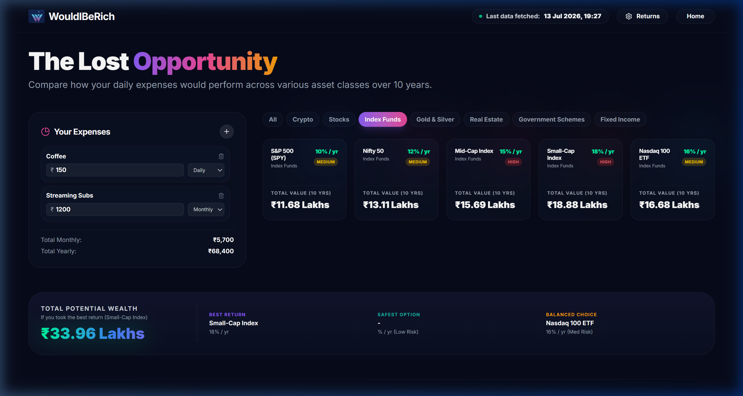
Opportunity Cost Visualizer
The primary calculator view plotting the terminal values of accumulated cash savings compared to compound index fund investing.
- ▪Interactive area graphs showing the compounding gap widening over 30 years.
- ▪Dynamic text boxes detailing the total cash spent vs potential investment value.
- ▪Hover coordinates showing exact portfolio totals at every year milestone.
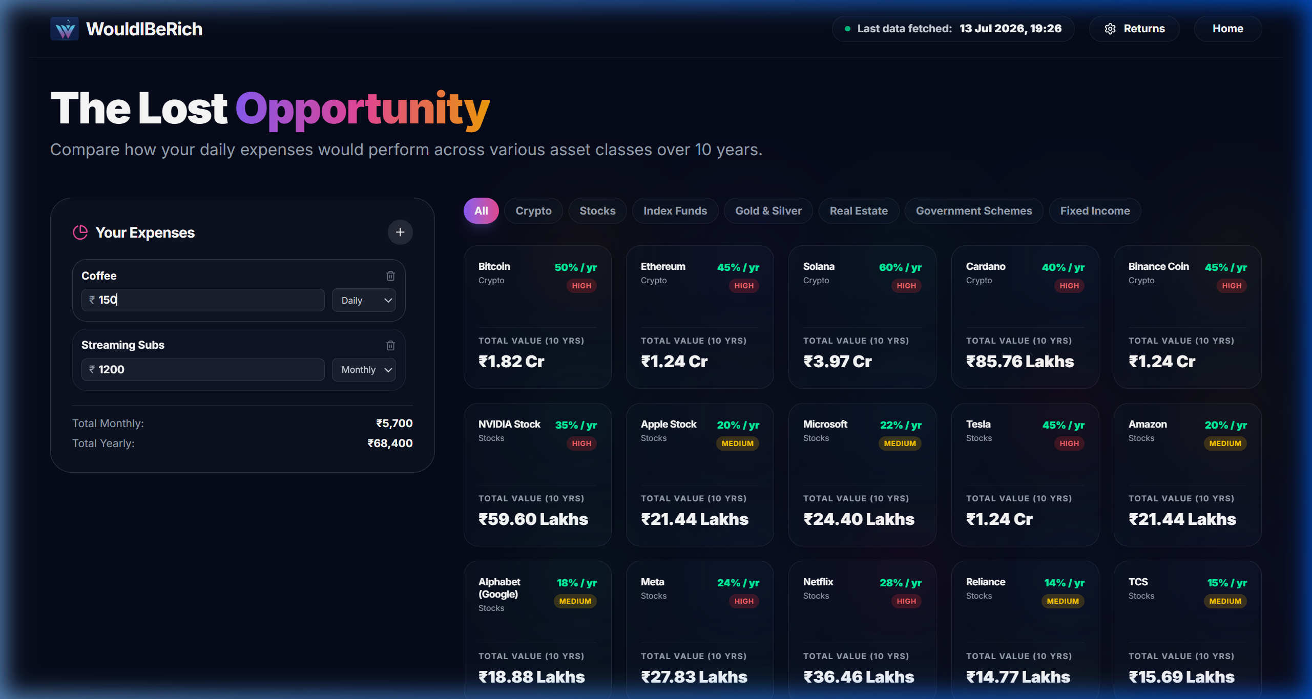
Interactive Habit Compound Sliders
A configuration interface allowing users to adjust monthly investment contributions, investment horizons, and expected annual return rates.
- ▪Lag-free sliding adjustments updating chart vectors instantly.
- ▪Visual markers indicating S&P 500, Nasdaq, and safe bond return averages.
- ▪Dynamic percentage counters detailing total investment gains vs cash principal.
Inflation Adjustment & Monte Carlo Models
A detailed settings card enabling users to factor in annual inflation rates and view probabilistic returns distributions.
- ▪Inflation-adjusted dollar calculations showing real purchasing power.
- ▪Toggle buttons to calculate conservative, moderate, or aggressive growth tracks.
- ▪Clear breakdown details explaining compounding mechanics.

Gamified Spending Habits Quiz
A quick quiz capturing common daily costs (lunches, streaming accounts, gym memberships) to build a custom investment principal base.
- ▪Interactive check cards mapping common products to monthly costs.
- ▪Aggregated total calculator showing annual micro-spending totals.
- ▪Instant result triggers generating custom compounding curves based on selections.
The Architectural Problem
Most consumers do not realize how micro-transactions and small daily spending habits compound into massive wealth losses over active working lifetimes.
The Implemented Solution
A gamified investment compound calculator that instantly converts small daily costs into future index-fund fortunes with full inflation parameters.
Functional Specifications
- [01]
Real-time compounding curves illustrating the cost of subscriptions.
- [02]
Inflation-adjusted terminal value calculations using dynamic Monte Carlo models.
- [03]
Interactive spending quiz demonstrating wealth loss over 10, 20, and 30 years.
- [04]
Responsive slider controls built completely in CSS.
Systems Architecture
Financial Calculator: Core mathematical formulas compounding daily habit inputs at chosen CAGR variables.
Visual Layer: Recharts AreaCharts displaying shaded curves mapping standard savings vs. compound investment paths.
State Management: React local state binding sliders to charts for instant, lag-free visual adjustments.
HAVE A SYSTEM TO DESIGN?
We scope and build custom web applications, advanced data visualization systems, and stateful AI dashboards in under 3 weeks.
LET'S DISCUSS YOUR PROJECT